Brand guidelines
DataAcre
visual identity
Guidelines for using the DataAcre name, logo, colors, and typography. Please follow these rules in all media, partnerships, and publications.
01 — Logo
Logo
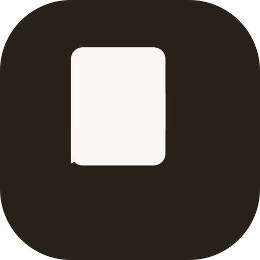
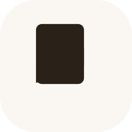
The DataAcre mark is a rounded square containing a stylized “D” representing a parcel of land. It pairs with the “DATAACRE” wordmark set in a heavy geometric sans.
Light mode — default
Usage rules
- ✓Always use the mark and wordmark together when space allows. The mark alone is acceptable for favicons, avatars, and tight layouts.
- ✓Maintain a minimum clear space around the logo equal to the height of the mark itself.
- ✓Minimum size for digital: 28px height for the mark. Print: 0.4 inches.
- ✓Do not rotate, stretch, skew, recolor outside the approved palette, or add effects (drop shadows, outlines, gradients) to the logo.
- ✓The wordmark is always set in uppercase with tight tracking. Do not replace the typeface.
- ✓On photographic backgrounds, use the cream-on-bark (dark mode) version and ensure sufficient contrast.
02 — Colors
Color palette
The palette is warm, earthy, and grounded. It evokes rural land without feeling rustic. Forest green signals growth and action. Gold signals value.
Primary text, dark surfaces, logo mark
Page background, light surfaces
Forest
#3D5A35
Primary action, CTA buttons, score pills
Forest Light
#E0EDDA
Success states, score highlight, accent cards
Forest Dark
#2E4828
Primary hover state
Accent, secondary CTA, premium indicators
Walnut
#6B5D4F
Secondary text, muted body copy
Tertiary text, labels, placeholders
Borders, dividers, light fills
03 — Typography
Typography
Display & headings
Serif. Used for headlines, display text, and numeric emphasis. Weights: 400, 700, 900.
Body & UI
Humanist sans. Used for body copy, UI elements, and labels. Weights: 400, 500, 600, 700.
04 — Voice
Voice & tone
We sound like
We don't sound like